The Process of Designing Conversa Studio
By Jana Kotysan, UI/UX Designer at StoryFile
The products we create at StoryFile push the boundaries of innovation within AI and video. With our Conversational Video technology, users can capture their personal and professional stories in a way others can interact with. The goal of Conversa Studio is to make this tool accessible to businesses, and simplify the process of creating a professional storyfile.
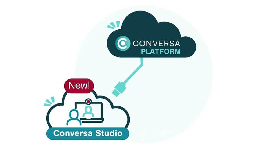
Conversa Studio is a branch of our Conversa platform that allows businesses to assign storyfiles to their employees and/or customers to create custom storyfiles with professional goals in mind. It breaks down the recording process into an easy step-by-step process, so the innovation can be accessible to users at all levels of technical understanding. Our CEO Stephen Smith envisions Conversa Studio to be a tool for, “customer service, talent acquisition, corporate training and onboarding, meet and greets with company leadership, and much more.”
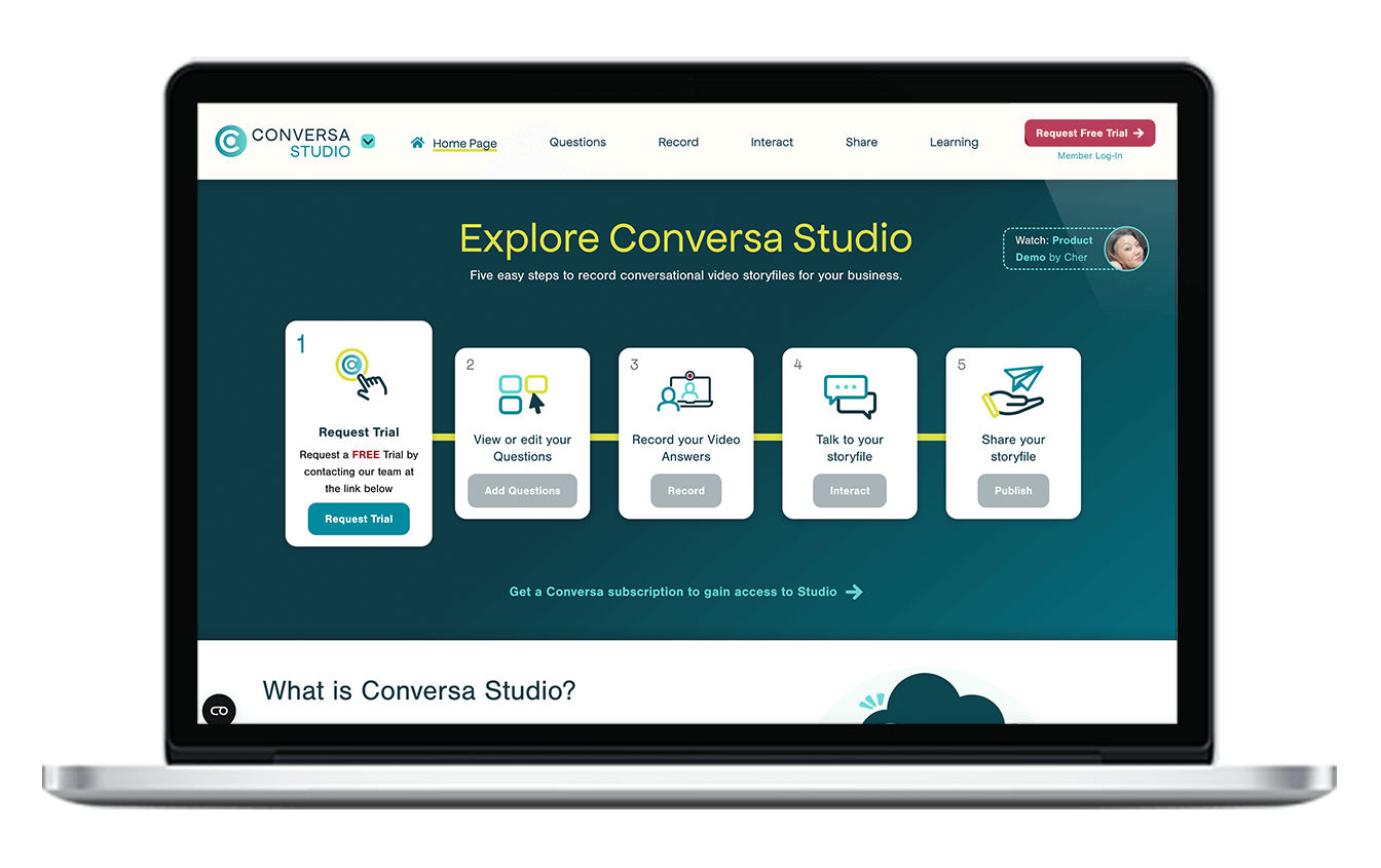
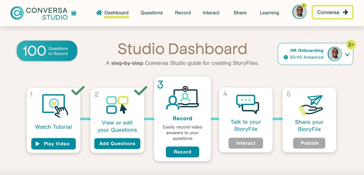
As a UI/UX Designer on this project, I wanted to push our technology and user experience forward. The first step towards doing this was to understand the problem we were attempting to solve. When beginning designs for Conversa Studio, I recognized that as the user, you may not understand our technology, and would need it broken down in a simple way. To solve this, I designed a 5-step dashboard to track progress through a client’s creation journey.
The dashboard tracks your progress and gives you guidance on the next step needed to complete a storyfile. Once you are logged in, the five steps of the dashboard include: Watch the video tutorial to learn how to use Conversa Studio, view your list of questions to answer, record your answers, talk to your storyfile, and share the storyfile with others. You can click between each step of the process once finished, to edit and update your storyfile as needed.
The color scheme of Conversa Studio was designed with StoryFile branded colors, but brightened up to add an element of fun to the process. Once logged in you’ll notice a lighter color scheme, and have the ability to view all of the storyfiles you can record into. Once you have completed a storyfile, you can switch to another with our storyfile switcher, which is located on the Dashboard, Record, and Interact screens. The switcher tracks your progress on recording answers, so you can get a bird’s-eye perspective on all the progress you’ve made.
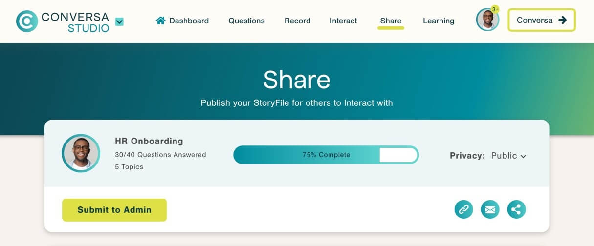
For an in-depth view of your account’s progress, the My StoryFiles page provides a breakdown of recording progress, as well as share links, and a button to notify your admin that the storyfile is complete.
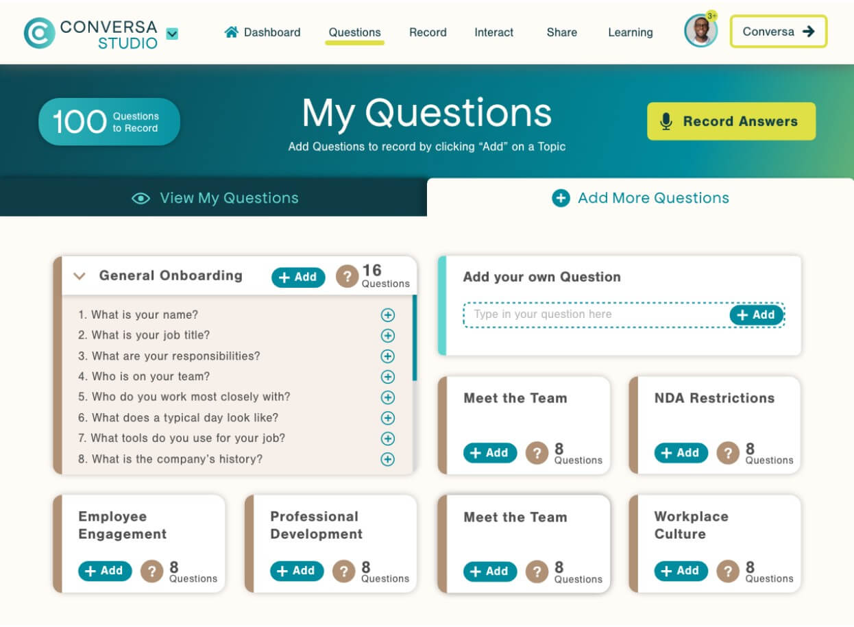
When designing this tool, I had to keep the user’s needs for understanding and delight equal with the business goals of creating a platform for business storyfiles. To focus on business questions, I designed a “My Questions” screen that allows admins to curate business scripts for their users to answer. A user can hide and show questions, so they also have freedom to answer questions from within this script that they are comfortable with. I recognized users may need flexibility to add their own custom questions to scripts, so I added an “Add your own Question” feature, where a user can type in a more specific question. This feature allows businesses flexibility and freedom to create scripts custom to their goals.
This is just the beginning of Conversa Studio! As a team we pride ourselves on being user-led and continue to grow from testing and iterating on feedback. As a designer, I am familiar with the process of testing and improving, over and over, so the product will grow and evolve just like we are at StoryFile.
If you are interested in a free trial of Conversa Studio for your employees, contact our support team to learn more!

